
Simple Website Design Tips for Better Engagement
Maine Local Archive >> Technology>> Simple Website Design Tips for Better Engagement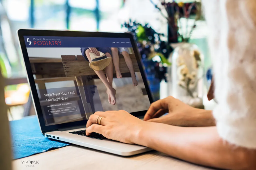
Simple Website Design Tips for Better Engagement
A good website does not feel like a puzzle, a sales pitch, or a crowded hallway. It feels like someone thought about the visitor before thinking about the brand. That is why Website Design Tips matter so much for American businesses trying to earn attention in a market where people leave fast and compare faster. A clean layout, clear message, and simple path can change how long someone stays, what they trust, and whether they take action.
For many small teams, the mistake starts with treating design as decoration. It is not. Design shapes patience, trust, and movement. A local dentist in Ohio, a roofing company in Texas, or a family-owned bakery in Arizona all face the same truth: visitors judge the site before they judge the service. Strong digital brand visibility begins when the page answers one quiet question: “Am I in the right place?” If the answer is clear within seconds, engagement becomes easier to earn.
Website Design Tips That Make First Impressions Feel Clear
First impressions do not begin with color or animation. They begin with recognition. A visitor lands on a page and tries to understand what the business does, who it helps, and what step comes next. When that answer feels muddy, even a good-looking site loses people.
Why does a simple homepage message keep visitors longer?
A homepage should not make visitors decode your business. The first screen needs one plain sentence that names the offer and the audience. A Chicago tax consultant might say, “Year-round tax help for freelancers and small business owners.” That line does more work than a clever slogan because it removes doubt.
Clarity also lowers the mental work required to stay. People do not browse business sites like novels. They scan, judge, and move. A headline that speaks plainly gives them enough confidence to keep reading instead of hitting the back button.
The counterintuitive part is that sharper messaging often feels less creative to the business owner. That is usually a good sign. Visitors are not looking for wordplay when they need a plumber, a lawyer, or a web designer. They are looking for proof that they found the right person.
How can visual hierarchy guide attention without feeling pushy?
Visual hierarchy tells the eye where to go first, second, and third. Big headings, short sections, clear buttons, and breathing room all help the visitor move without being shoved. A site with ten equal-size elements on the screen makes every choice feel equal, which means no choice feels easy.
A strong page gives priority to one main action. For example, a home service company may want calls, while a software startup may want demo requests. The design should support that goal with a bold call-to-action above the fold, then repeat it in natural places after trust has been built.
Good hierarchy is not loud. It is disciplined. The best pages often feel calm because the business had the nerve to remove things that competed for attention. That restraint earns more engagement than another banner, badge, or pop-up fighting for space.
Build Trust Through Layout, Proof, and Human Detail
Once the visitor understands the offer, the next question arrives fast: “Can I trust this?” Trust is not created by one testimonial or one badge. It comes from the way the whole page behaves. Honest design feels steady, specific, and easy to verify.
Why do real details beat generic trust signals?
Generic trust signals have lost power because everyone uses them. “Trusted by customers” means less than “Serving homeowners across Tampa since 2014.” Specific details create weight because they sound like they belong to a real business, not a template.
A small business website design can earn trust by showing names, neighborhoods served, team photos, project examples, and clear service boundaries. A landscaping company in Colorado does not need vague claims about excellence. It needs before-and-after photos, seasonal service notes, and a phone number that is easy to find.
The unexpected insight is that imperfection can help. A real photo of the owner on a job site may outperform a polished stock image because it feels accountable. Visitors know the difference between a business that exists and a brand that is hiding behind glossy filler.
How should testimonials and reviews be placed for better website engagement?
Testimonials work best when they support a decision the visitor is already trying to make. A review near a pricing section can reduce fear. A short quote beside a service description can make the offer feel proven. Random praise dumped near the bottom of a page often gets ignored.
Better website engagement comes from placing social proof near moments of hesitation. If a visitor is reading about emergency HVAC repair, a review from a local customer who got same-day help carries weight. The proof matches the concern.
Review sections also need texture. Use names, cities, service types, and short quotes instead of long walls of praise. A few grounded details beat a dozen empty five-star comments. Real trust feels particular. Fake trust feels polished smooth.
Make Navigation Feel Effortless on Every Screen
A visitor should never wonder where the menu went, how to return to the homepage, or which button matters. Navigation is the quiet backbone of a site. When it works, people barely notice it. When it fails, they leave with irritation they may not even name.
What makes mobile navigation easier for local American customers?
Mobile visitors often arrive with intent. They may be sitting in a parked car, comparing services during lunch, or searching after a problem appears at home. That context changes everything. Your mobile site must help them act fast.
A user friendly website design keeps the mobile menu short, places phone numbers within thumb reach, and avoids crowded dropdowns. For a local clinic, “Book Appointment,” “Services,” “Insurance,” and “Location” may matter more than a deep menu filled with company history.
The strange truth is that mobile design often reveals whether the business knows its customer. A restaurant site that hides hours beneath three taps is not thinking about hungry people. A contractor site that makes the quote form painful is not thinking about homeowners comparing three bids.
How can fewer menu items increase clicks?
Fewer menu items can increase clicks because choice has a cost. When a menu has twelve links, visitors slow down. When it has five clear paths, they move with less friction. The design feels more confident because it is not asking the visitor to organize the business in their head.
A good menu uses visitor language, not internal language. “Services” beats “Solutions” for most local businesses. “Pricing” beats “Plans and Packages” when people want cost clarity. “Contact” still works because everyone knows what it means.
This is where many owners get nervous. They want every page visible because every page took effort to create. But navigation is not a storage shelf. It is a road sign. A sign with too many arrows helps nobody.
Turn Attention Into Action With Smarter Page Flow
Engagement is not only time on page. Time matters, but movement matters more. A visitor who reads three sections and does nothing may be less valuable than one who reads one strong section and calls. Good page flow turns interest into a next step without making the page feel needy.
How does website conversion design reduce hesitation?
Website conversion design starts by noticing where visitors pause. They pause before forms, prices, bookings, calls, and purchases. Those moments need reassurance, not pressure. Clear labels, short forms, privacy notes, and honest expectations can keep people moving.
A law firm in Atlanta may improve conversions by changing “Submit” to “Request a Free Case Review.” That small change tells the visitor what happens next. A roofing company may add “No obligation, response within one business day” near the quote form. The visitor feels less exposed.
The counterintuitive move is to slow down the sale in the right places. A page that answers objections before asking for contact details often performs better than one that begs for action too early. People move faster when they feel less trapped.
Why should calls-to-action match the visitor’s stage?
Every visitor is not ready to buy. Some want prices. Some want proof. Some want to compare. A single hard call-to-action repeated everywhere can feel blunt, especially for services with higher cost or personal risk.
A smarter page offers different steps without scattering attention. A primary button might say “Book a Consultation,” while a softer link says “See Recent Projects.” That gives cautious visitors a path that still keeps them inside the site.
This approach works well for small business website design because local buyers often need confidence before contact. They may want to see service areas, read reviews, or check license details. The page should respect that behavior instead of treating hesitation as failure.
Use Content and Design Together Instead of Separately
A beautiful layout cannot save weak content, and strong writing struggles inside a messy design. The two need to work as one system. Design creates the path, while content gives the visitor a reason to stay on it.
How can short sections make a page feel easier to read?
Short sections help because people scan before they commit. A dense page asks too much too soon. Clear headings, tight paragraphs, and useful spacing let visitors sample the content without feeling buried.
This does not mean the page should be thin. It means depth should be broken into digestible pieces. A financial advisor in North Carolina can explain retirement planning in a rich way while still using short sections, plain headings, and clear examples.
The best content feels generous, not heavy. It answers the question in the visitor’s mind and then gives the next detail at the exact moment they need it. That timing is where strong design and strong writing meet.
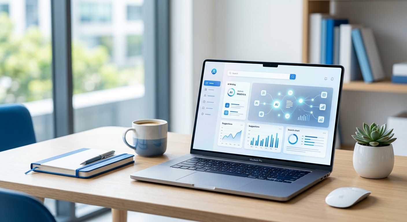
What role do images play in user friendly website design?
Images should explain, prove, or humanize. They should not exist only to fill space. A photo of a finished kitchen renovation, a staff member greeting a client, or a product in use can answer questions faster than a paragraph.
User friendly website design uses images with purpose. Every image should have a job. If it does not show the service, build trust, clarify the process, or make the brand feel more human, it may be slowing the page down without earning its place.
Alt text also matters because it supports accessibility and search visibility. A useful image description such as “website design tips shown in a clean mobile homepage layout” helps more than vague labels like “image one.” Good design includes people who browse, scan, listen, and search in different ways.
Keep Speed, Accessibility, and Maintenance in the Design Plan
A site can look finished and still fail under real use. Slow pages, poor contrast, broken forms, and old content quietly drain engagement. The visitor may not know why the site feels hard to use. They only know they do not want to stay.
Why does page speed affect trust before content is read?
Page speed creates a first impression before the headline even appears. A slow site feels careless. Visitors may wonder whether the business is outdated, overloaded, or not serious about details.
This matters more on mobile, where many users deal with weaker signals, older devices, or limited patience. A local service business cannot assume every visitor arrives from a fast desktop connection. Heavy images, bloated scripts, and unnecessary effects can cost real leads.
The odd part is that speed improvements often look invisible to the business owner. Nothing dramatic changes on the page. Yet visitors feel the difference because the site responds without making them wait. Quiet fixes can produce loud results.
How can accessibility choices improve engagement for everyone?
Accessibility is often framed as a compliance issue, but it is also good design. Clear contrast, readable font sizes, keyboard-friendly forms, descriptive links, and captions help more people use the site with less effort.
These choices help older visitors, busy parents, people outdoors in glare, users with vision limits, and anyone trying to read quickly on a phone. Better website engagement grows when fewer people hit avoidable barriers.
A practical accessibility mindset also makes the site feel more professional. It shows care. When a business respects how people actually browse, the experience becomes easier for everyone, not only for users with specific needs.
Conclusion
The strongest websites do not win because they are flashy. They win because they make visitors feel oriented, respected, and ready to act. That kind of design takes discipline. It asks you to remove clutter, write plainly, show proof, and build pages around real user behavior instead of personal taste.
The next time you review your site, do not start by asking whether it looks modern. Ask whether a first-time visitor can understand the offer in seconds, trust the business within a few scrolls, and take the next step without friction. Those questions reveal more than any design trend.
Strong Website Design Tips are not about chasing a perfect layout. They are about building a page that earns attention honestly and turns that attention into movement. Start with one page, one message, and one action you want visitors to take. Fix that first, and the rest of the site will become easier to improve.
Frequently Asked Questions
What are the best website design tips for small businesses?
Start with a clear headline, simple navigation, fast loading, strong local proof, and one main call-to-action per page. Small businesses should avoid clutter because visitors need to understand the offer quickly before comparing other local options.
How can I make my website more engaging for visitors?
Use plain messaging, short sections, helpful visuals, and calls-to-action that match visitor intent. Engagement improves when people can find answers fast, trust what they see, and move through the page without confusion or pressure.
Why is mobile-friendly website design so important?
Most visitors check business websites on phones, often while comparing options. A mobile-friendly site keeps menus simple, buttons easy to tap, text readable, and contact details visible. Poor mobile design can cost leads before visitors read the page.
How many menu items should a business website have?
Most small business websites work best with five to seven main menu items. The goal is not to show every page. The goal is to guide visitors toward the pages that help them understand, trust, and contact the business.
What makes a homepage design effective?
An effective homepage explains the offer, names the audience, builds trust, and points visitors toward the next step. It should not feel crowded. The best homepages make the business easy to understand before asking the visitor to act.
How do website images affect user engagement?
Images affect trust, speed, and clarity. Real photos, project examples, and useful product visuals can help visitors connect with the business. Large, generic, or slow-loading images can weaken the experience and make the page feel less credible.
What is the biggest mistake in website design?
The biggest mistake is designing for the business owner instead of the visitor. Internal preferences often lead to cluttered menus, vague headlines, and weak calls-to-action. Good design starts with what the visitor needs to know first.
How often should a business update its website design?
Review the site every 6 to 12 months, especially pages that drive calls, bookings, or sales. Updates do not always require a full redesign. Better copy, faster pages, stronger proof, and cleaner navigation can improve results quickly.
Related Post
How an Aqua Facial Machine Can Elevate Professional Skincare Treatments
Professional facial treatments have moved beyond traditional cleansing, steaming, and manual exfoliation. Modern salons and…